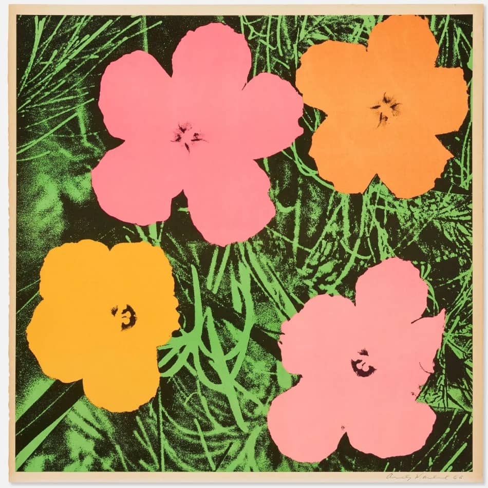
Andy Warhol Flowers 1964 / Offset lithograph / signed, dated / edition 300
Andy Warhols Flowers 1964 brilliant colors made it one of his most influential works within the art scene and at the same time one of the most timeless and iconic works of Western art of the 1960s.
| Year: | 1964 |
| Format: | 58,4 x 58,4 cm / 22.8 x 22.8 inch |
| Material: | Wove paper. |
| Method: | Offset lithograph. |
| Edition: | 300 |
| Other: | handsigned, dated 66. |
Andy Warhol Flowers 1964 with its yellow and pink colors and a green background, is at once representational and abstract, and is one of the classics of Andy Warhol.
Andy Warhol – Flowers 1964.

| Year: | 1964 |
| Format: | 58,4 x 58,4 cm / 22.8 x 22.8 inch |
| Material: | Wove paper. |
| Method: | Offset lithograph. |
| Edition: | 300 |
| Other: | handsigned, dated 66. |
Andy Warhol - Flowers 1964.
Andy Warhol Flowers 1964 (Feldman/Schellmann II.6) is one of the main motifs in Andy Warhol’s subject matter, also created as silkscreens on canvas. It was published by Leo Castelli Gallery, New York. While the Flowers appear emblematic of Warhol’s iconography today, at the time of their creation they were a remarkable departure from images of commerce (Campbell’s Soup) or celebrity (Marilyn Monroe) for which the artist became known. Fifty years after the publication of the Flowers portfolio, the flowers occupy a unique position in the canon of Warhol’s early prints. Warhol recalls looking around his studio and seeing only Marilyn, disasters, and death. What has become a classic Warhol image for collectors today was originally a rebellious image of love and positivity. Considering Warhol’s earlier work, his choice to depict flowers seems at first atypical. The previous project was a series titled 13 Most Wanted Men, in which he silkscreened images of mug shots from the 1962 NYPD brochure. (He created the work for this year’s New York Art Fair, but the exhibition was censored before it opened.) At this point, one can imagine that flowers, apolitical and removed from time and space, became an attractive subject. In 1970, Andy Warhol produced the flowers, also known as “1970 Flowers”, based on the hibiscus photo, with 10 different color combinations in an edition of 250 pieces each. They are 36 x 36 inch / 91.44 x 91.44 cm silkscreen prints, signed and numbered on the reverse. Based on a single image template, which was extensively tested, only 10 prints with different color combinations were to be issued in each case. However, instead of a direct encounter with nature itself, Warhol used for these prints a photograph of hibiscus flowers that he had found in the 1964 issue of Modern Photography. When Patricia Caulfield, the photographer of this image, learned of this, she sued Warhol in 1966 for unauthorized use of her image.
There is something ironic, almost comical, about the fact that Warhol filed a lawsuit over the use of a simple flower image after years of copying copyrighted product labels – as if, in Warhol’s hands, even an unremarkable motif could become embroiled in controversy, politics, and the law. Their startling colors contradicted traditional colors in nature, and their subject matter signaled a departure from Warhol’s commercialism. Here, the artist’s interest in still life is explored in detail, as he continued to cut and sift repeatedly, illustrating the artist’s affinity for repetition. First on canvas, then eventually on paper. Until Flowers established itself as one of Pop Art’s most iconic series. Its impulsive color combinations are reminiscent of the Flower Power movement of the 1960s and ’70s, serving as a symbol of passive resistance and non-violent ideology. In the floral prints, several blocks of color form the four flowers, while a gray variant outlines the grass bed. The silkscreen process naturally lends itself to experiments with color and layering, and Warhol experimented with both, using different color schemes and painting the flowers bright pink and orange in one print and all white in the next. In some of the prints, he deviates from the original template by creating shadows of multiple flowers through multiple silkscreens. Playful and inviting without being intrusive, Flowers was first exhibited in 1964 at the Leo Castelli Gallery in New York. While the flower series may fit seamlessly into Warhol’s oeuvre today, the subject matter was a distinct departure at the time for an artist known primarily for his paintings of brands. Flowers themselves are iconic and timeless, and not tied to any particular pop culture reference or idea. In fact, the flower in Warhol’s prints is hard to identify, and critics at the time were unable to name them, which was part of the fascination. Warhol said, “My fascination with repeating and repeating images-or in the case of film, “letting them go on”-is an expression of my belief that we spend much of our lives seeing without watching.” Although this is an interesting statement from an artist who observed photographs rather than nature directly, this series – in all its playfulness, vibrancy and abstraction – causes us to reconsider the universal appeal of flowers each season.
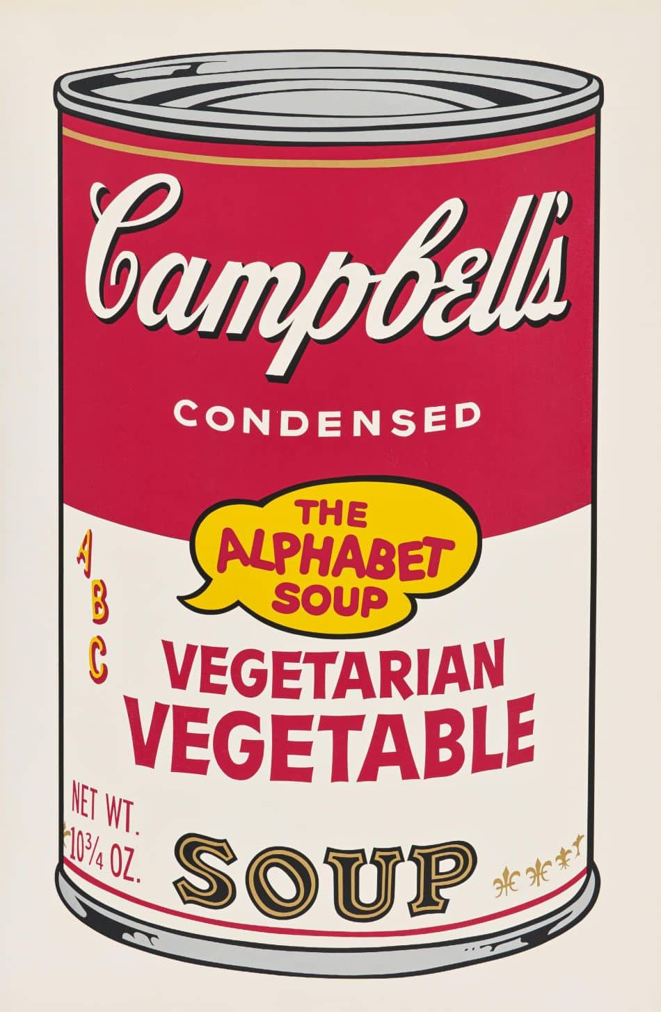
- Andy Warhol Campbell’s Soup Vegetarian Vegetable (F. & S. II.56) / Screenprint / signed, numbered / edition 250
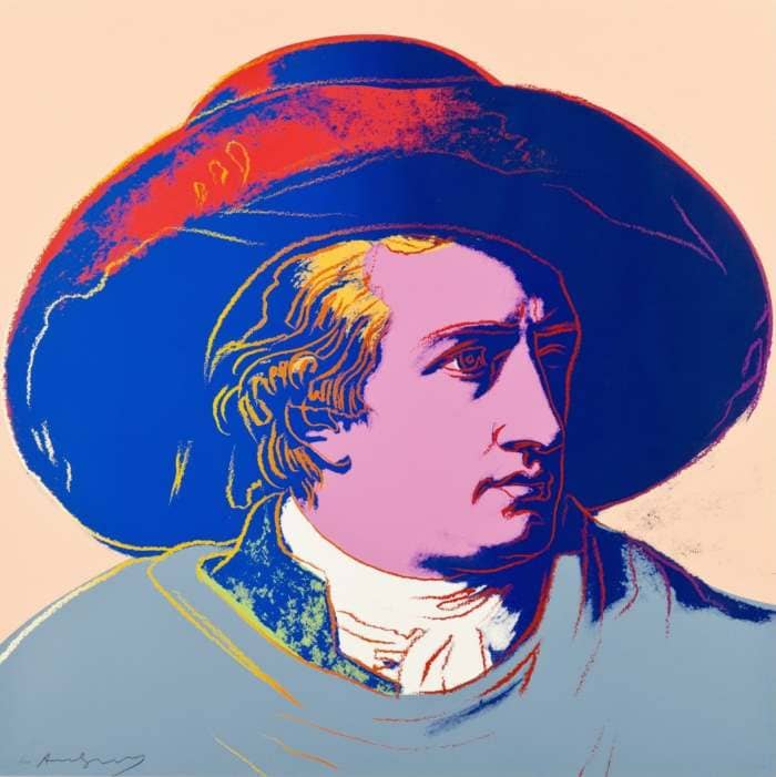
- Andy Warhol Goethe (FS II.273) / Screenprint / signed, numbered / edition 100
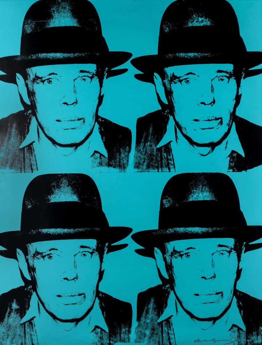
- Andy Warhol Joseph Beuys State I (FS II.242) / Screenprint / signed, numbered / edition 150
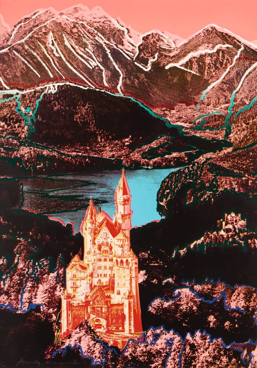
- Andy Warhol Neuschwanstein (FS II.372) / Screenprint / signed, numbered / edition 100


Year: 1964
Format: 58,4 x 58,4 cm / 22.8 x 22.8 inch
Material:Wove paper.
Method:Offset lithograph.
Edition:300
Other:handsigned, dated 66.


